Showing posts with label drawing. Show all posts

Tuesday, July 24, 2012

Wetcanvas Portrait Challenge


Sorry, I haven’t posted in a long time.  I don’t know whether it is the summer, my belief a week-long vacation was enough time off, or possibly just laziness.  The summer is normally a little slower for me, filled with distractions but I need to get out of this rut and get back to business.

I don’t remember the last time I tried a master copy, but Wetcanvas June portrait challenge was a perfect opportunity to get back on track while taking on a fairly difficult task.  
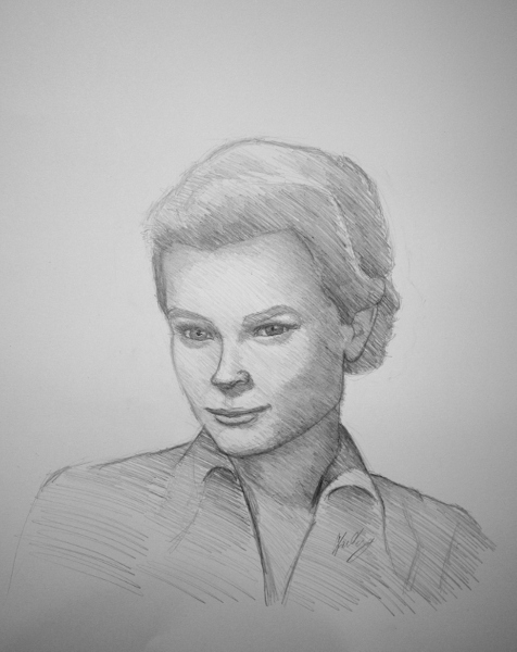
John Singer Sargent’s work is amazing although I’m not too familiar with a lot of his work.  The quality and emotion in his drawings and paintings are amazing. 

Emily Sargent is John Singer Sargent daughter and such a beautiful lady which led to an amazing painting.  I know there was no way I could do any justice trying to paint this in watercolor or oil so colored pencil and graphite was the best approach for me, using a simple two color interpretation.  I forgot how hard it was to copy a master until I started.  Outside of the painting looking amazing from so many levels, I am happy with the results as a sketch.  I know it would take me well over 100 hours to do any justice to this masterpiece. 


Emily Sargent


Crescenzo Fusciardi drawing was very tricky and complex.  The lines and transparent quality of charcoal was what drew me in.  For a line drawing there is so much subtle information.   At the very end of the sketch I was happy until I looked at my drawing beside the original.  There was no comparison to the original by a long shot.  I believe the collar bone and shoulder are fairly close to the original and that is itJ


CrescenzoFusciardi


Head of a Capri girl was the most frustrating drawing out of the three.  I like a good challenge but this was rather tedious because there are so many subtle changes.  I quickly took the drawing for granted and assumed I was going in the right direction and before I knew it was time to yell, scream and start over. 
Whenever I have a very difficult time with proportions I have a tendency to sketch muscular features, tones and contours that are easily visible to work through.  I like the line drawing the most but lost so much when I started adding tone and value.  I am very happy I took the time to sketch these master drawings and learned so much.  The most valuable lesson learned was being humbled and having a greater appreciation of the Masters of the past.


Sunday, April 1, 2012

Daily Painters of Pennsylvania Challenge


First I would like to thank DPP artists and especially Mary Beth Brath for allowing me to participate in March DPP challenge. 

I was initially drawn to DPP challenge because of the light and my assumption of wow this would be fun to draw, little did I know my interpretation of a bird’s nest was going to be a painful one which involved some research, patience and a technique I might have used once or twice in the past.  The light hit the eggs just right, not to dark and not to light with a little bit of reflected light and shadow.   Things got a little problematic or stressful when it was time to address the nest ( I should of did a close up).  I figured a negative drawing of the nest was the best approach, although it was rather difficult to see a pattern to the nest other than overlapping sticks and twigs.  Twenty plus hours later, I’m fairly happy with result although it’s not complete, close up looks so good right now J.  Hopefully I will have time to go back and complete the drawing and post the entire nest as opposed to the close up.


Bird’s nest 5" x 7"
Colored pencil, white chalk & graphite on toned paper


Bird’s nest WIP

Sunday, March 11, 2012

Clio, the Muse of History WIP


I’m moving in a new direction with this drawing, and not focus so much detail or the photo-realistic approach used for Ronald.  I’m not giving up on my detailed approach but trying to see what else can be accomplished by focusing on form and composition.  I hope this drawing is successful in conveying more emotion or interest.

Wednesday, March 7, 2012

Clio, the Muse of History WIP


I took this photo in Gettysburg last month for the upcoming Gettysburg Festival plein air event.  There are a few areas I normally go to in Gettysburg to draw and paint but I have a tendency to always stay close to my comfort zone or the familiar places.  This particular morning I came out with the intentions of taking photos, no sketch pad, no paint, just my camera on a beautiful day. 

Initially some of my photographs were okay but I wasn’t getting the perfect picture or the “that’s it moment” until the end of the morning. 

I thought I should take a few photos of the monuments that mean so much to us.  I am glad I took the time to really get out of my normal mind set and enjoy the landscape.  Clio sits fairly high on Slocum Ave in Gettysburg.  A frontal picture wasn’t too appealing since it didn’t show exactly what she was doing, but from her right side were very interesting angles.  It was amazing especially not knowing at the time the angles were going to work so well together. 

Below is a link to the monument.


Wednesday, January 25, 2012

WIP Final


I wish I had the opportunity to find out more about this man but unfortunately, I don’t even know his name.  He has such a compelling face, a story to tell and I wonder what he was thinking when his picture was taken.  I hope I have done a good job capturing him emotion and portraying his humanity.
I added more value in his face and coat before using workable fixative. Graphite dust was used on the background to create more depth.  At some point I might go back to this drawing to add more detail.
Photo reference: Robert Dziewulski

Sunday, December 11, 2011

Sketch


‘Eli Wallach’ graphite on Arches CP.

I should have drawn this on Bristol, but I couldn’t resist cold press paper.  I normally get better results when drawing older faces on textured paper.  A nice start but I should have put more time into it.  At least I can say it’s a sketch and I'm doneJ. 

Photo reference: Wetcanvas weekly drawing challenge.

Sketch


I had a lot of fun with this, very interesting angles and her face.  Contour drawing before shading (Can I say my sketch is done at this point next time?).


I’m changing the norm from watercolor CP paper to Bristol board.  I have fallen in love with textured paper, but my most recent work was a little too textured for my liking.  Bristol smoothness is a welcome change to CP but I’ll have to do a few more pieces.  So much for being lazy and using the same type of paper for every application.

 ‘Grace Kelly’ graphite on Strathmore Bristol board.

Photo reference: Wetcanvas weekly drawing challenge.

Thursday, November 3, 2011

Brian and Family

“Brian & Family” 22”x30” graphite on Arches 140lb

Brian is a close friend of the family and married my wife and I.  I was honored when I had the opportunity to paint a family portrait.
The portrait was going to be completed in watercolor but due to time constraints graphite had a better likelihood of being completed in time and thankfully Brian didn’t mind.
At some point I hope I have an opportunity to paint a family portrait for Brian.

Thursday, October 27, 2011

Rose


Rose 9" x 11.5" graphite and watercolor pencil on Arches 140lb watercolor paper

I was initially drawn to this photo for the interesting lines, single color and an opportunity to capture wood texture.  This was the first time I attempting to draw wood and use watercolor pencils together.  I normally use watercolor pencils for sketching plein air or color studies. 
My first sketch was a value study for the wood texture and layering watercolor pencils wet or dry.   The second sketch was on Arches cold press (a little texture/tooth to the paper) and the watercolor pencil showed too much texture.  The only solution was to apply the watercolor pencils wet with a brush.
I am very satisfied with the result although I don’t see myself using watercolor pencils and graphite on textured paper any time soon. 
Photo reference from desicomments.

Friday, October 21, 2011

Marbles


“Marbles” Arches 140lb watercolor paper

This subject was different as very interesting to see how much form affects a drawing. My initial assumptions were I could easily capture and show the form of marbles with a high level of contrast and reflection.  I believe the drawing is fairly successful in capturing the form, and reflections, although the reflections, highlights and shadows draw a lot of attention.
The reference photo has a wide range of warm and cool colors.  I will complete a painting and compare the drawing and painting at some point.  
Reference photo from Wetcanvas.com.  
Related Posts Plugin for WordPress, Blogger...