Saturday, December 31, 2011

2011 Recap

This year was a great starting point for me as an artist.  I initially began this journey with the intent of having no regrets and I believe I have accomplished that fairly well. There are a few paintings and drawings left to do, but that’s for another year.  At the beginning of the year I had no real aspirations other than drawing, painting, and drawing some more.  A simple formula I guess, and for me it boiled down to being consistent and always creating artwork.  Throughout the year I realized this journey was well worth the effort and, with support, everything I set out to do was accomplished.
I would like to thank everyone that has visited and followed my blog.   I would also like to thank my family, friends, teachers, and mentors.  Without all of you this year would have been a lot harder and not quite as enjoyable. 
I hope 2012 is just as enjoyable and an even bigger learning experience.  I already have a long list of goals and things to do from exploring color, different subjects and much more.
Thank you, God bless and I wish the best for all of you in 2012.

Thursday, December 29, 2011

Sketch

"Little Girl"
9"x 11" graphite on Strathmore.
I started this earlier this month for WC monthly challenge and never got a chance to finish this sketch.   


Friday, December 23, 2011

Sam


"Sam"
9.5"x11" graphite on Arches CP.

Sam started out as a sketch months ago and went very well. Almost too well for a sketch, so I’m finally getting around to finish the drawing.   

Sunday, December 11, 2011

Sketch


‘Eli Wallach’ graphite on Arches CP.

I should have drawn this on Bristol, but I couldn’t resist cold press paper.  I normally get better results when drawing older faces on textured paper.  A nice start but I should have put more time into it.  At least I can say it’s a sketch and I'm doneJ. 

Photo reference: Wetcanvas weekly drawing challenge.

Sketch


I had a lot of fun with this, very interesting angles and her face.  Contour drawing before shading (Can I say my sketch is done at this point next time?).


I’m changing the norm from watercolor CP paper to Bristol board.  I have fallen in love with textured paper, but my most recent work was a little too textured for my liking.  Bristol smoothness is a welcome change to CP but I’ll have to do a few more pieces.  So much for being lazy and using the same type of paper for every application.

 ‘Grace Kelly’ graphite on Strathmore Bristol board.

Photo reference: Wetcanvas weekly drawing challenge.

Sunday, December 4, 2011

Sketch


'Bill' 8.5”x 10.5” graphite on Strathmore Drawing 400 Series


Another sketch from Wetcanvas November-December portraiture challenge.  I started this drawing with no real expectations other than to sketch, have fun and see where it takes me. 
There are two light sources in the photo and normally can be a problem for me, but the light weren’t equally as bright and there were enough shadows to easily resolve this.
I made it a priority to have a wide value range from the bright area in his shirt and highlights to the shadows and background. 

Sketch


'Anthony Hopkins' 9”x 10” graphite on Strathmore Drawing 400 Series


I love to draw and sketch and this was a perfect opportunity to go back to what I enjoy.  I often feel to rigid and tight after completing a portrait that can take 25+ hours to complete. 
I was drawn to this photo because of the opportunity to capture a likeness of a famous actor, angles, and light and dark.  The emotion on his face was rather interesting and a sketch would be a great opportunity to explore and have fun.
Photo reference: Wetcanvas.com November-December portraiture challenge.

Sunday, November 27, 2011

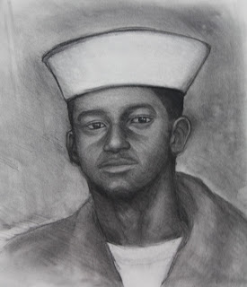
Self portrait

'Self portrait' 12”x 14” charcoal on Strathmore Drawing 400 Series
I normally don’t draw a lot of self-portraits, but this photo means a lot to me.  The photo was taken right after boot camp in Great Lakes, IL.  I always appreciate looking back at the good memories I have being enlisted in the Navy and having the opportunity to serve my country. 
This sketch was done with charcoal but I normally work with graphite, charcoal give me the opportunity to work negative and positive.   
I’m very happy with the likeness although I have drawn and painted this photo before.

Thursday, November 3, 2011

Brian and Family

“Brian & Family” 22”x30” graphite on Arches 140lb

Brian is a close friend of the family and married my wife and I.  I was honored when I had the opportunity to paint a family portrait.
The portrait was going to be completed in watercolor but due to time constraints graphite had a better likelihood of being completed in time and thankfully Brian didn’t mind.
At some point I hope I have an opportunity to paint a family portrait for Brian.

Thursday, October 27, 2011

Rose


Rose 9" x 11.5" graphite and watercolor pencil on Arches 140lb watercolor paper

I was initially drawn to this photo for the interesting lines, single color and an opportunity to capture wood texture.  This was the first time I attempting to draw wood and use watercolor pencils together.  I normally use watercolor pencils for sketching plein air or color studies. 
My first sketch was a value study for the wood texture and layering watercolor pencils wet or dry.   The second sketch was on Arches cold press (a little texture/tooth to the paper) and the watercolor pencil showed too much texture.  The only solution was to apply the watercolor pencils wet with a brush.
I am very satisfied with the result although I don’t see myself using watercolor pencils and graphite on textured paper any time soon. 
Photo reference from desicomments.

Friday, October 21, 2011

Marbles


“Marbles” Arches 140lb watercolor paper

This subject was different as very interesting to see how much form affects a drawing. My initial assumptions were I could easily capture and show the form of marbles with a high level of contrast and reflection.  I believe the drawing is fairly successful in capturing the form, and reflections, although the reflections, highlights and shadows draw a lot of attention.
The reference photo has a wide range of warm and cool colors.  I will complete a painting and compare the drawing and painting at some point.  
Reference photo from Wetcanvas.com.  

Flower


"Red flower" 6.5" x 8.5" watercolor on Arches 140lb
I had a lot of fun with this flower.  The initial sketch in pencil was deeper in values, but I decided to keep the overall values relatively close.  The background colors (cool greens and blues) were somewhat muted in color but overall the contrast and strength in color were still close.
  
The reference photo did not have a lot of lights and darks, so the goal of this painting was to capture the strong reds and subtle violets.

Wednesday, October 12, 2011

Yellow Hibiscus


"Yellow Hibiscus" 6.5" x 8.5" watercolor on Arches 140lb paper

This is the second time I painted this flower.  The first attempt although somewhat successful did not have enough strong yellows, deep reds and the shadows were too muted to complete the first painting.  The second and final painting was complete with Watercolor Artist Andy Smith.

Andy Smith is a mentor, and great watercolor artist.  Andy has been painting professionally as a watercolor artist since 1980. I am amazed with the quality and amount of postings on his blog and the amount of art shows he attend every year.  The first time I met Andy and Linda they were more focused on helping me as a person, and artist before I became his student.  

Thank you Andy & Linda for giving me the motivation, advice and support I needed to keep going with my art.

Tuesday, October 11, 2011

Red Hibiscus


"Red Hibiscus" watercolor on Arches 140lb paper

This Hibiscus was rather interesting photograph for a couple of reasons.  The reds are very strong and saturated in color even the shadows weren’t too washed out or muted.  The light was also strong and appeared white in the photo. 
I am interested in strong light that washes out all local color, detail and appears pure white.  I will eventually complete a series focused on light and darks using juxtaposing and counterchange.  I don’t know if it will be in color or B&W.  
Drawing allows me to slow down to really understand the subject, values, composition and how to play with different techniques to accomplish my goals.    
Reference photo from Sandra Blair http://www.sandrablairphotography.com/.  Sandra Blair is an amazing wildlife artist, photographer and mentor. 
Sandra is currently working on a fund-raising campaign on kickstarter.com “Seeking Refuge: Four Seasons on Assateague Island”.  Her goals are to create approximately 20 paintings of the local wildlife on Assateague Island.  Please join me in supporting her and our wildlife.   
http://www.kickstarter.com/projects/sandrablair/seeking-refuge-four-seasons-on-assateague-island

Saturday, October 1, 2011

Brandon


Brandon
pencil on Arches Watercolor paper 140lb
NFS


Brandon was a challenge for a couple of reasons.  The photo quality was very good, but suffered from frontal flash and was a little distorted since the photo was taken so close.  I normally sketch my subject once or twice depending upon complexity, composition and tone value (light and dark).  I wish there were more shadows or highlights to create more interest, but I am happy how the portrait turned out.
 

Wednesday, September 28, 2011

Addison


Addi
11" x 14"


This is my beautiful daughter Addison.  I really enjoyed drawing her, this is only the fifth time I have drawn her but it was fun and her daycare teacher really loves it.

Saturday, September 24, 2011

Pencil Portraits


Josi
 A beautiful baby, and a great photo to work from.  I love Josi's emotion and the range of lights and darks made it so enjoyable to draw.  I started painting her but never got around to finishing it.  Maybe next year if time permits.


Addi & Aunt Beulah


I'm so glad I had the opportunity to complete this portrait for my wife great aunt.  One of my daughter's favorite aunt.


Jim
Good photo but rather difficult because of limited (indoor fluorescent) light sources.  There was some reflected light on the underside of his nose and light shadow.  The photo isn't picking up the subtle shift in light. 


The Kids


Gotta love old photos, my wife (middle) and her siblings.  This one was a little unique, from the size 18"x24", I couldn't make it any bigger and I didn't want to crop them in to close or made them smaller. 

Related Posts Plugin for WordPress, Blogger...